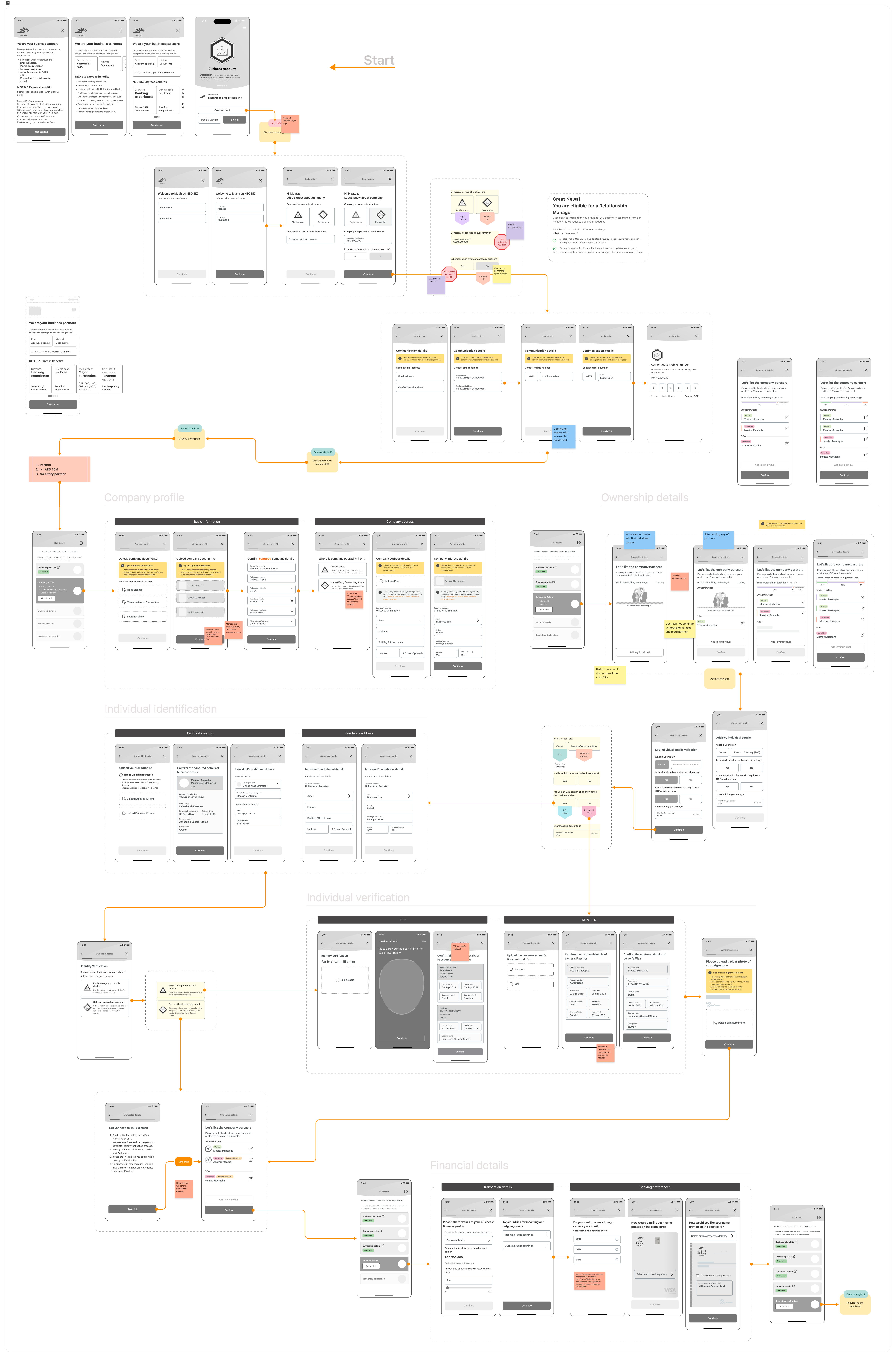
Discovery
Understanding the Core Problem
Challenges
With this in mind, our next hurdle was not just about solving a technical problem but also a human one. How could we convince users to try this solution and trust it enough to rely on it in critical moments? That’s when I recalled a book I had read two years prior, Hooked by Nir Eyal. The principles in that book left a lasting impression on me, and this seemed like the perfect opportunity to apply what I had learned. It was time to uncover the hidden opportunities in this challenge and craft a solution that would genuinely engage users.
Discovering Opportunities
Before jumping into design, we needed to deeply understand our users. Who exactly would benefit from this product? A brainstorming session with the product manager helped us sketch out the initial persona—a user who carries multiple rechargeable devices and finds themselves in places without accessible charging options.
But it was more nuanced than that. While it’s easy to charge devices in your car or ask someone in a café for a charger, there are environments where this isn’t feasible: hospitals, banks, malls—places where people spend significant time but have limited charging options.
Thus, our persona evolved. We were targeting heavy device users—people who depend on multiple gadgets for socializing, gaming, or staying in touch with family—yet frequently find themselves in situations where their devices are out of charge, with no immediate solution available.
User personas
The Persona Takes Shape
The user persona became crystal clear: Someone who is a heavy user of more than one rechargeable device, often socializing or spending time outdoors, and is eager to keep their devices charged without disruption.
Expected Scenarios
Scenario 1:
My Battery is Not Fully Charged, and It’s Not About to Die (Yellow Mode)
Home screen (Yellow mode): The user is notified their battery is low but not critical.
Options:
- Get battery fully charged
- Discover
- Charge
- Redeem
- Return
Scenario 2: My battery is about to die (Red mode)
Home screen (Red mode): Urgent action is needed due to critically low battery.
Options:
- Charge now
- Discover
- Charge
- Redeem
- Return
Scenario 3: My battery is currently charging (Green mode)
Home screen (Green mode)**: Battery charging is in progress.
Options:
- Redeem
- Return
Scenario 1: My battery is not fully charged, and it’s not about to die (Yellow mode)
Home screen (Yellow mode): The user is notified their battery is low but not critical.
Options:
- - Get battery fully charged
- Discover
- Charge
- Redeem
- Return
Scenario 1: My battery is not fully charged, and it’s not about to die (Yellow mode)
Home screen (Yellow mode): The user is notified their battery is low but not critical.
Options:
- - Get battery fully charged
- Discover
- Charge
- Redeem
- Return
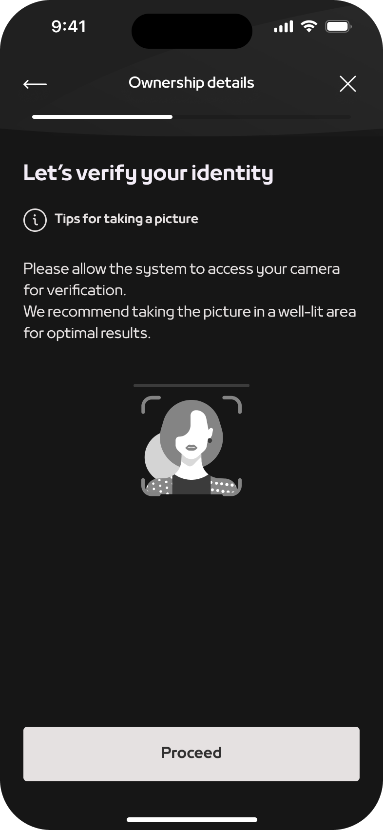
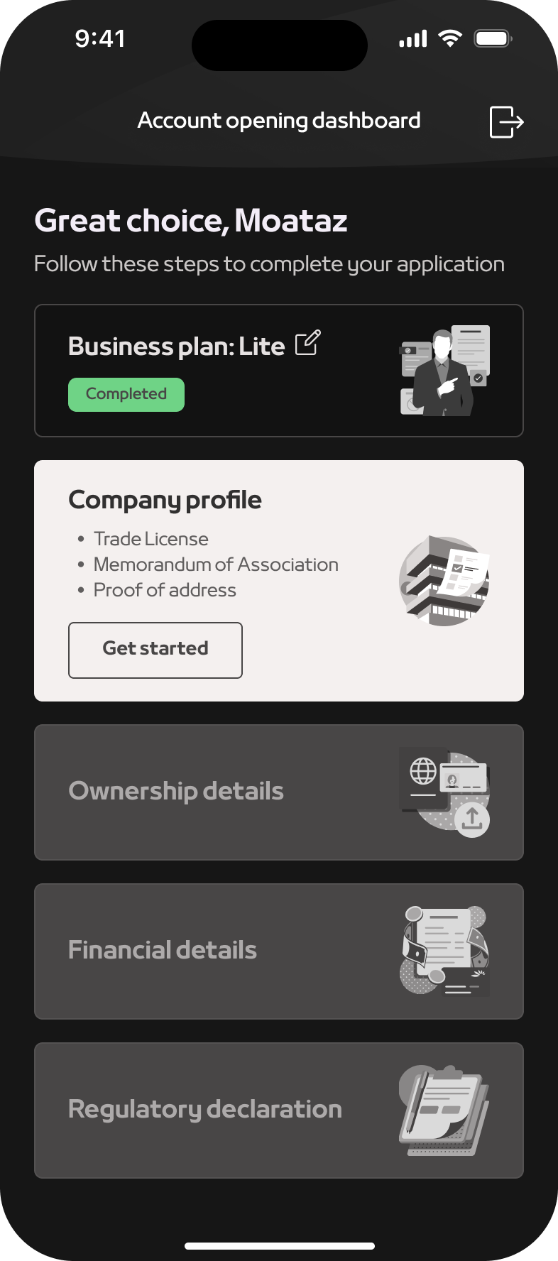
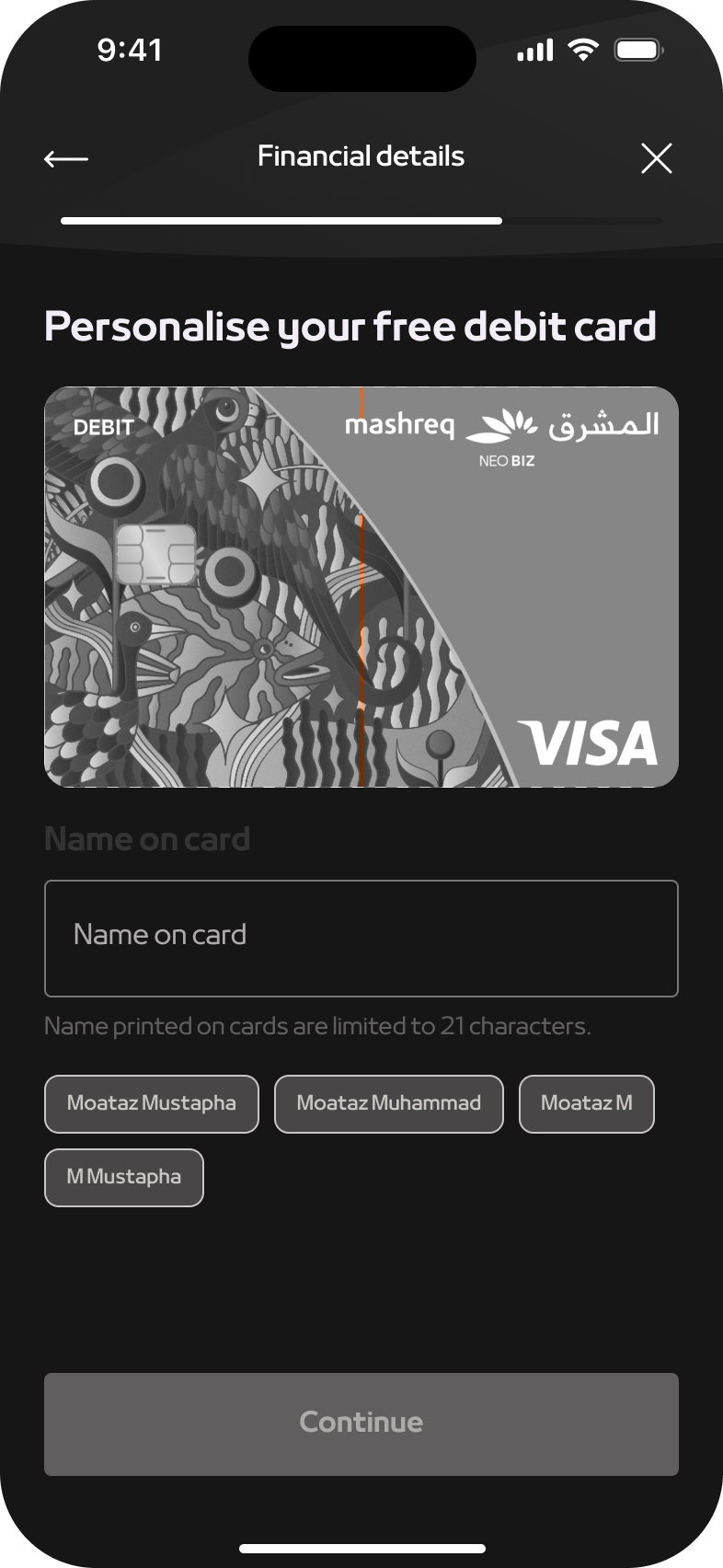
Key Findings
The research revealed several critical pain points: users found the existing onboarding forms too lengthy and confusing, security concerns were prominent, and there was a significant need for real-time assistance during the process. Users also preferred a mobile-first approach for convenience.
Competitive analysis
Benchmarking
By analysing the onboarding processes of leading competitors, we identified best practices and areas where our process lagged. Competitors with streamlined, user-friendly onboarding flows had higher user satisfaction and lower abandonment rates, highlighting the need for an improved user experience.